

Rockhill Ridge Brand Kit
*
Rockhill Ridge Brand Kit *
Rockhill Ridge Neighborhood Assoc. Brand Kit
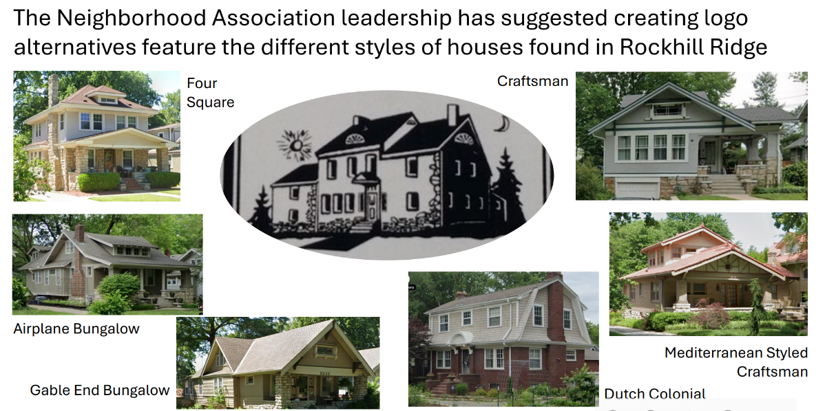
Client Presentation, Housing examples.
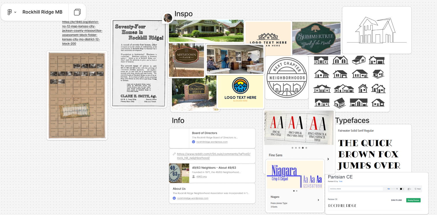
Rockhill Ridge Moodboard and Resarch Board, 2025
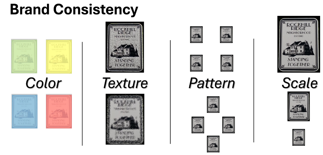
Client Presentation, Signage Examples
For this project, this was my final for Graphic Design 3, also known as Student Design Lab. For the first time, we would work with real clients for a project of our choice. The one I chose was a brand kit for the Rockhill Ridge Neighborhood Association. I wanted to diversify my type of work since I have never done it before. However, each project required a certain number of people; in my case, it was three.
However, no one else in the course wanted to pick this project, so I had to complete it as a solo project.
After thorough research, I began building the pieces together for my moodboard. The biggest thing I wanted to go for was the simplification of the house illustration, which is what the client desired. For the drafts or options, I was inspired by suburban neighborhood signs as seen in my moodboard. I also wanted to keep the color palette muted and simple as well.
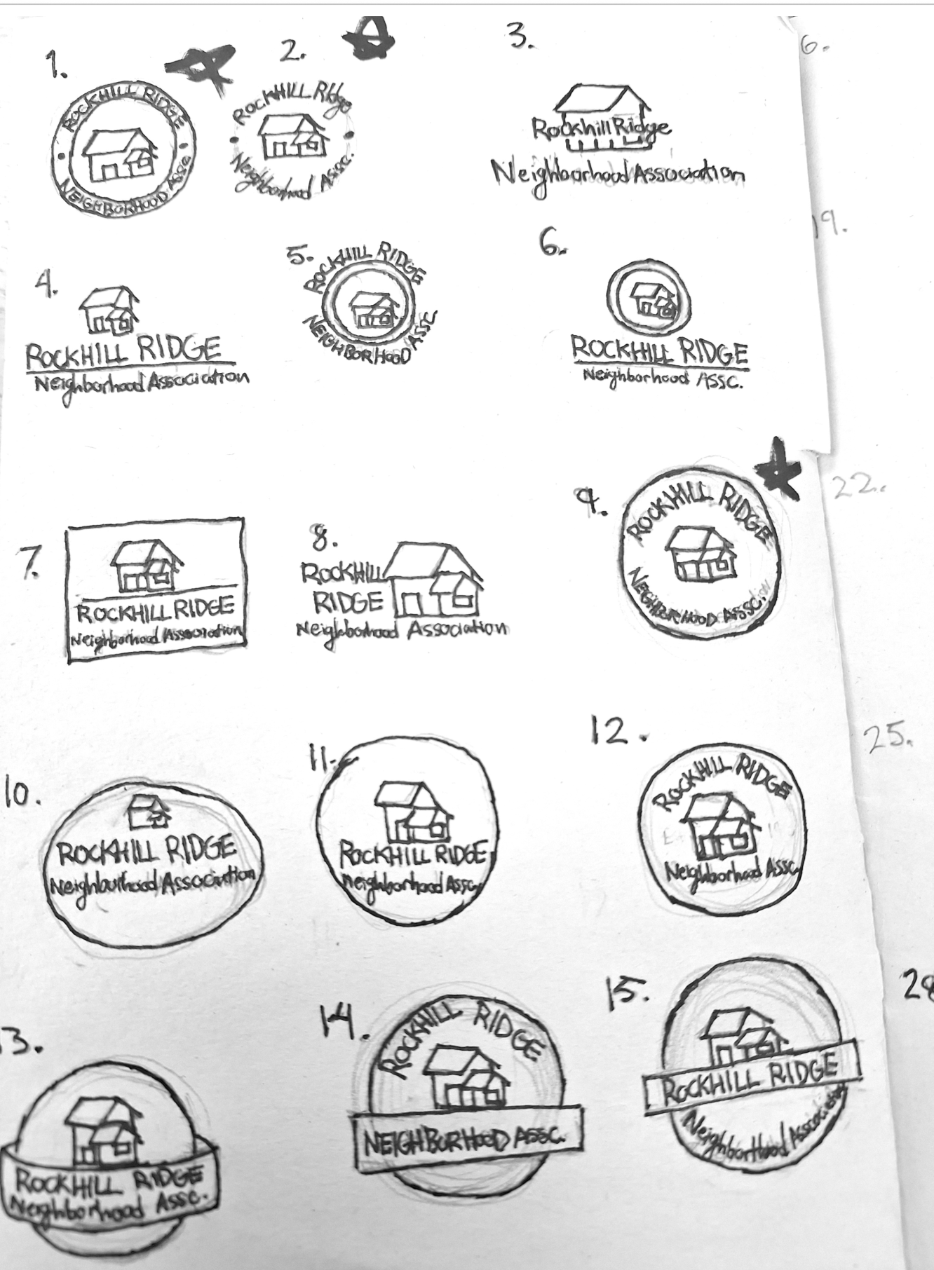
However, the paper logo had to go through a class critique first. The class would tally their votes; mine were #1 and #2.
Thus, afterwards, we were to create 15 more logos based on the class feedback given. I kept my original inspiration but stayed within the desired circle. However, I decided to think more outside the box when it came to the shape.
My classmates voted for the third digital logo to be presented to the client due to my earlier initiative to keep things simple, and in the case that the client wanted larger changes to the logo, there would be a lot more room to improve it without taking away the essence of the original logo.
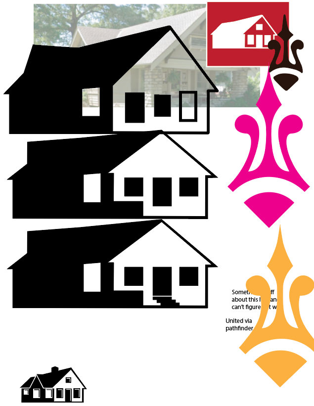
House illustration drafts 2
The client wanted a logo that could be used on multiple means of signage. After the client sent the aforementioned presentation detailing what they are looking for in this brand kit. I concluded it would be far better to simplify things to improve recognition and visibility. I also decided to pick one of their common house shapes as the basis for the logo. As mentioned previously, I wanted to go with a muted color palette with good contrast. I noted several common colors in neighborhood signage, such as beige, dark browns, or forest greens. One rule I try to follow is no more than three colors in a logo, but I relegated it to two for the sake of this project.
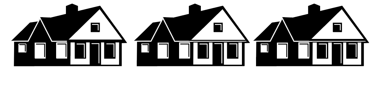
House Illustration Drafts 3
For the final part of the house illustration, the client wanted a foundation and stairs that more closely match those in their neighborhood. I liked the idea of inverting the two-toned design of the house on the foundation, as I thought it would look more integrated into the overall design rather than an afterthought, as in my first iteration.
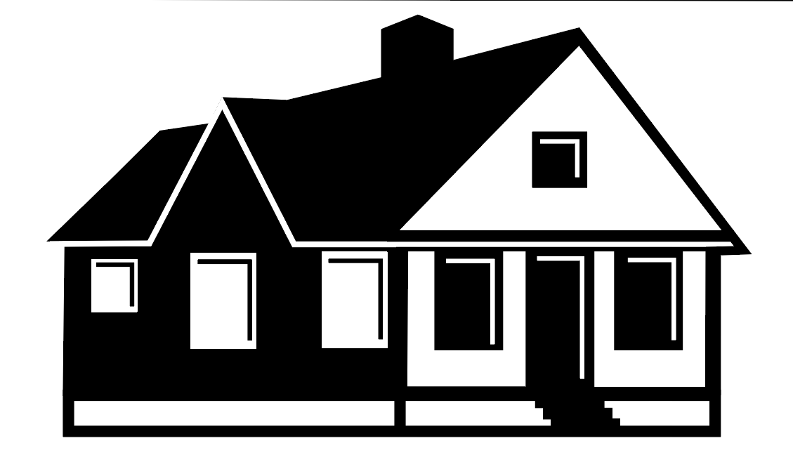
House Illustration Drafts w/ version 1
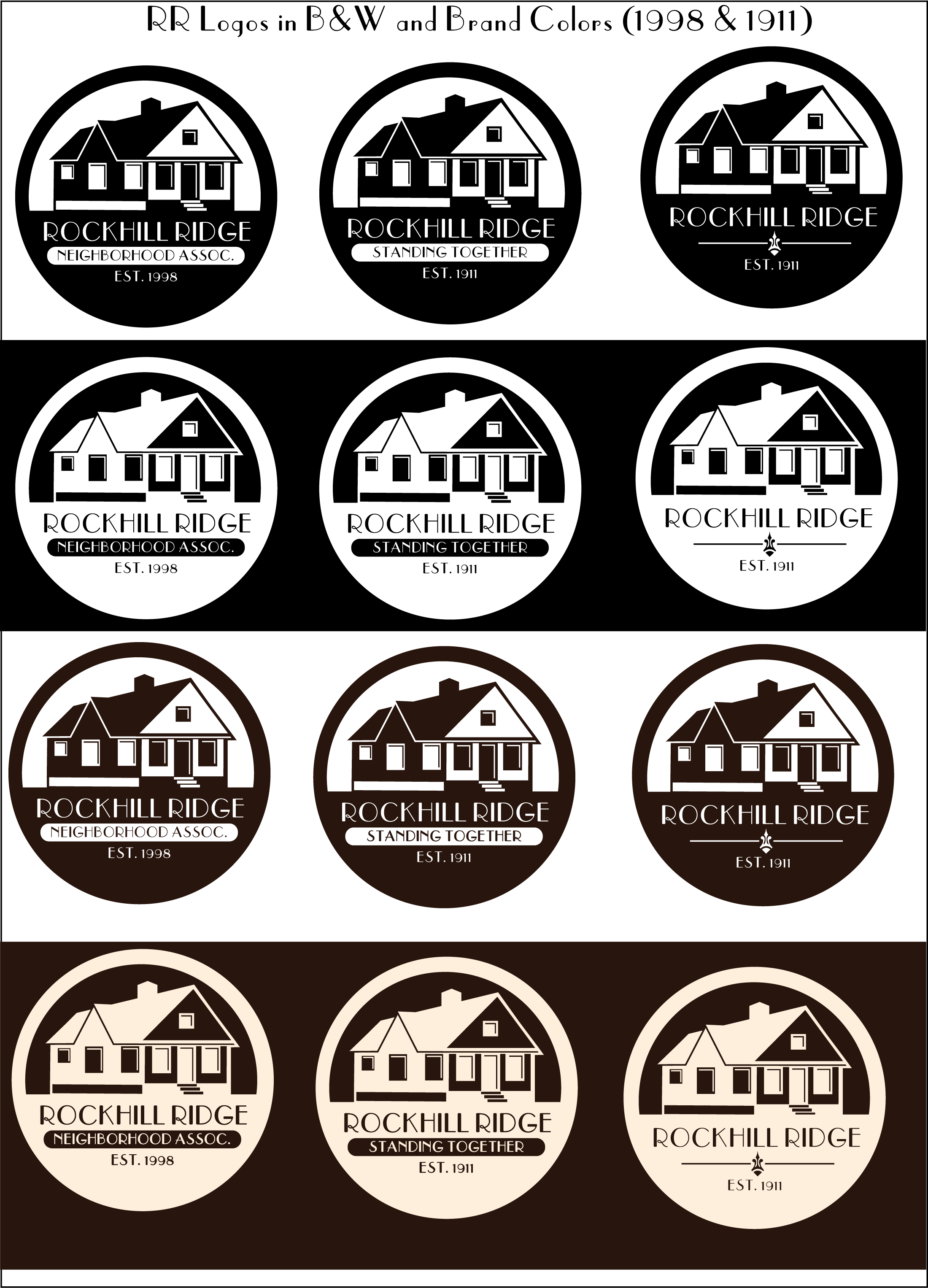
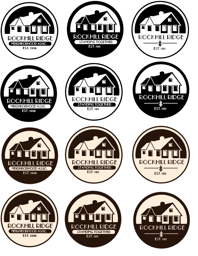
Logo in Color and B/W, Final
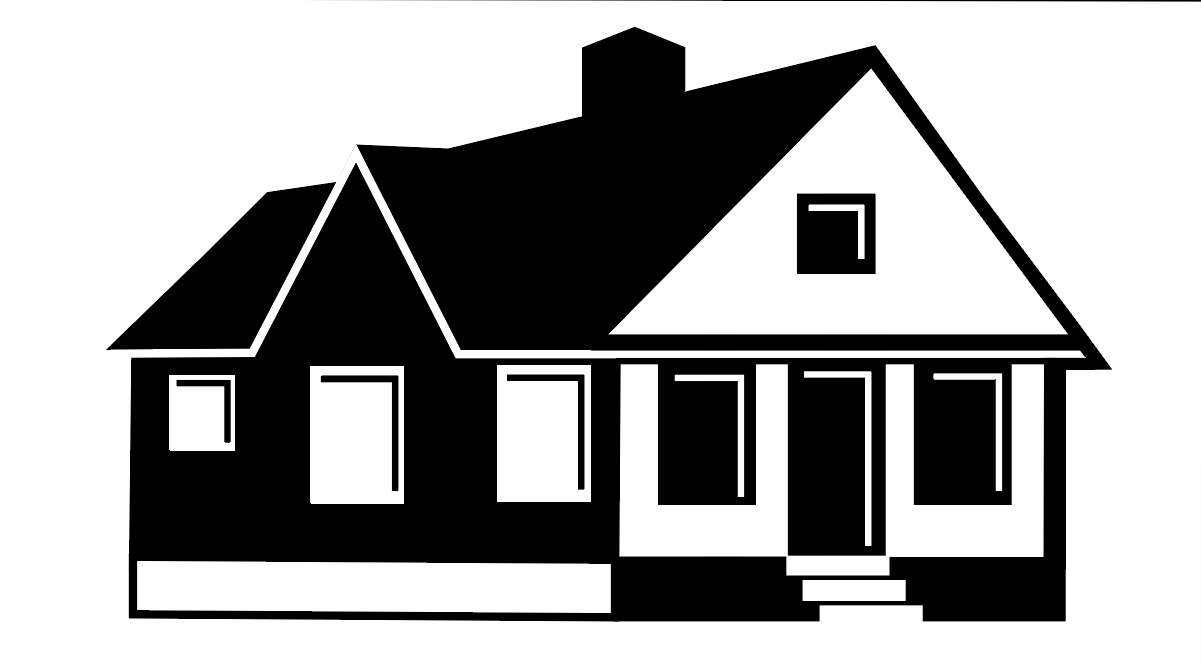
House Illustration Drafts w/ version 2 (Final)
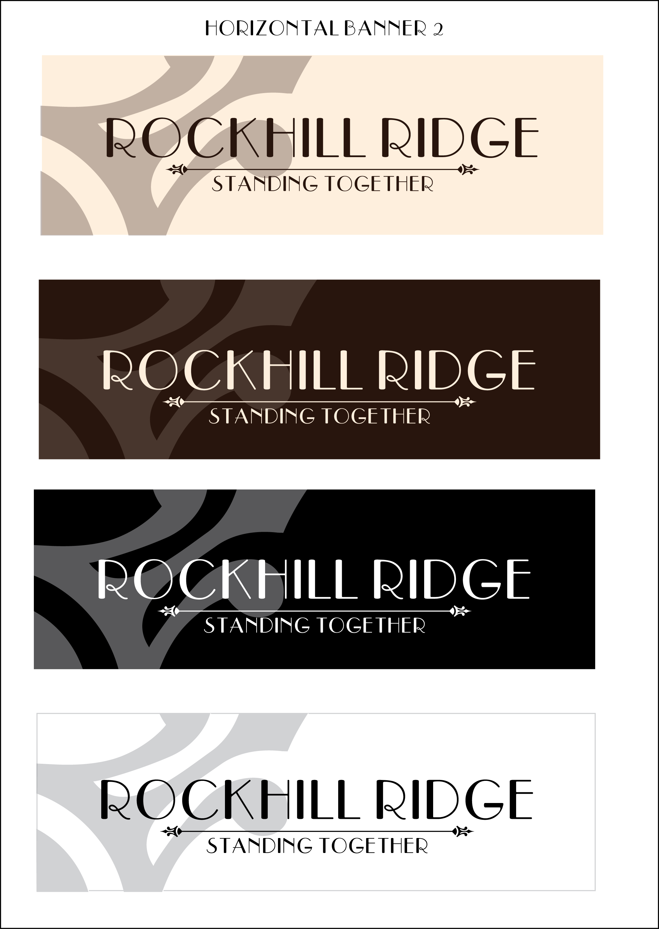
Horizontal Banners in Color and B/W, Final
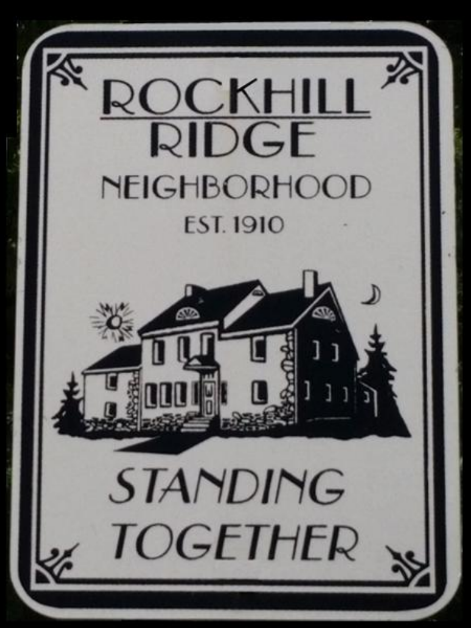
Rockhill Ridge, Original Signage
Color Palette Options
Old Final Logos in Color and B/W
At first, the four presented logos were going to consist of the four presented here and were given to the client for use. However, the client had changed their mind and desired a new design for the logo. Instead, they wanted to move forward with digital draft #10 along with designs for horizontal and vertical banners.
Final Horizontal Banners in color and b/w
Semi-Final, House Illustration version 3.
Though I was very unfamiliar with the brand kit,
I had done external research on what had to be included. After drafting the written text, I met with my client to review it for understanding. We conversed, and I made sure that the wording I created was phrased in a way they’d understand and what instructions they’d like for me to add. I also included hex, Pantone, and CMYK codes for the brand colors used, along with placement for the watermark, document, and merchandise. Body and heading text usage was also included. Lastly, I gave instructions on how the logos were to be used and multiple versions of said logos for any use the client sees fit.
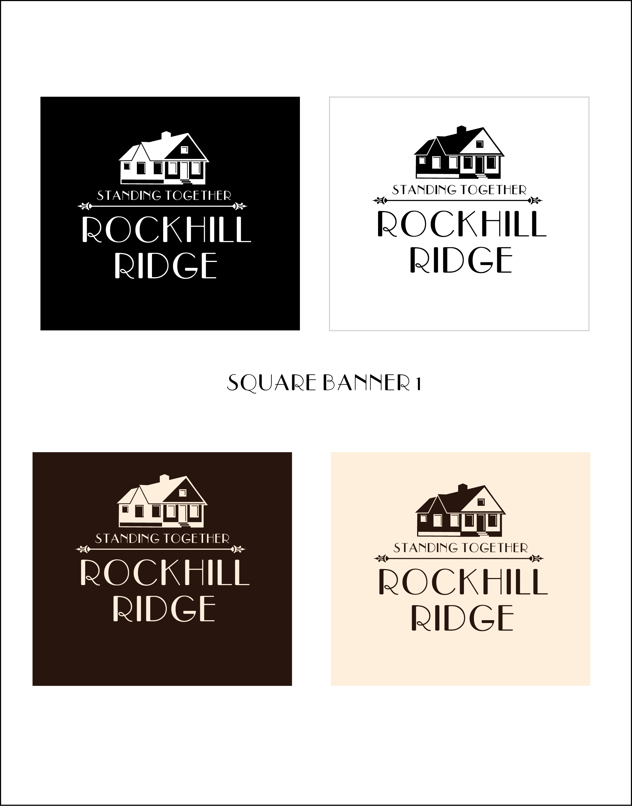
Square Banners in Color and B/W, Final
For the banners, I wanted to focus more on the type, with any iconography being background images to draw more attention to the neighborhood and slogan for the sake of maintaining simplicity, as these would most likely be going on merchandise of varying mediums. (i.e., water bottles, shirts, hats, etc.). In the end, I thoroughly enjoyed this project and see it as a first step towards what it’s like working with clients and what I could do in the future as my skills improve.
If you’d like to see the full brand kit, here’s the Figma link.
Rockhill Ridge drawn logo drafts, 2025
House illustration drafts 1
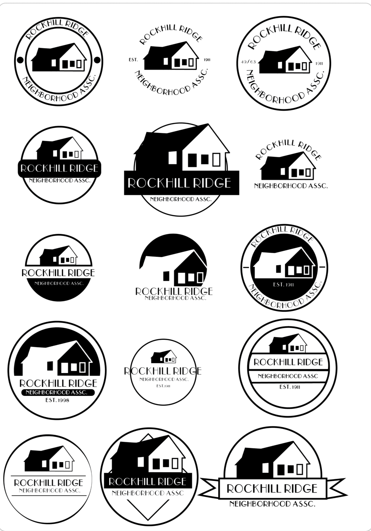
Rockhill Ridge digital drafts, 2025