Black Rep in Gaming Zine
*
Black Rep in Gaming Zine *
Black Rep in Gaming Zine

Moodboard-2024, the second palette was chosen
This was my Final in Graphic Design l. It was completely self-directed with no limitations on topic or medium. I decided to do black representation in gaming since this personally affects me as a black woman and gamer, along with many other black gamers as well.
I originally was going to do an 18x24 poster; however, my professor recommended I create a zine due to the depth and scope of my topic.

Icons created in Adobe Illustrator
The icons were created in Illustrator with a mixture of the rectangular, ellipse, pencil, and line tools. Each represents the many ways gamers play video games (Console, PC, Laptop, except for mobile), with the 20-sided die being added as an extra item to make things interesting. Each was also recolored to Magenta and blue in draft one, then later yellow in draft two to better fit the theme of the zine and bring more color variety overall.

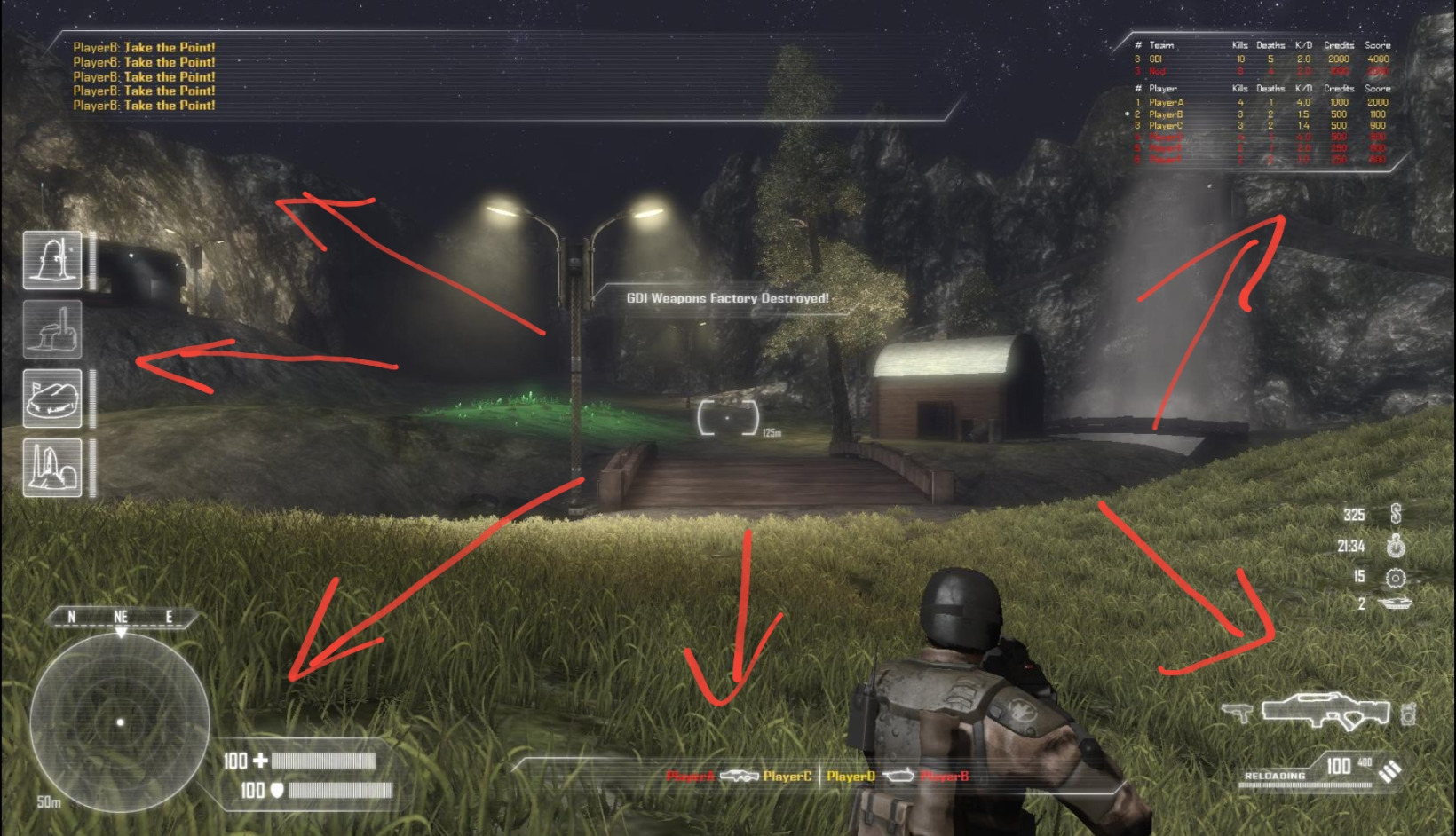
'Heads-up-Display (HUD): necessary, or breaker of immersion?' by u/MoNKeY-HoRDe on r/gaming, Reddit
My original idea was to just print it on regular paper and add some background elements such as the icons from my title page. However, my professor suggested that I should implement a HUD (Head Up Display) a thing that is commonly used in FPS (First-Person Shooter) and some TPS (Third-Person shooter) games to lean into that high-end PC gaming feel.

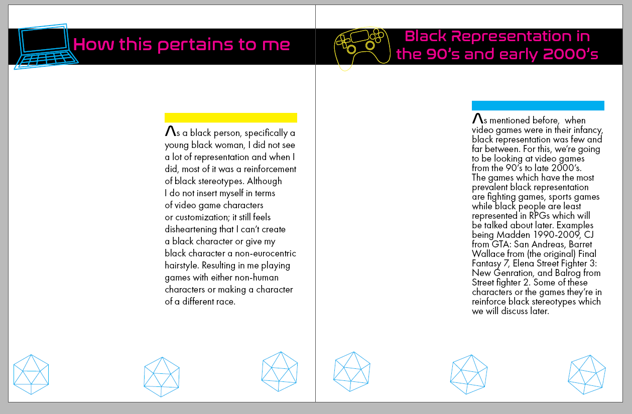
Text Page Draft 1
Thus I decided to use transparency paper to print my text and icons on while the background pictures (along with the title and back page) will be on regular white paper. I chose some of the colors in Palette Two and Nasalization font as I thought they fit the neon, high-end, tron-esque PC look. I also enlarged the title page design so it would not feel so empty. The book was spiral-bound to hold everything together. Originally there were two dice on each corner of the page; however, my professor suggested I have more dice scattered out and rotate by two degrees each to make it look like it rolling across the page.

Keeping a few notes from draft 1, I felt as though the page was a bit plain and I wanted to make use of the icons I created. So I decided to make them a second background for the transparency paper. The opacity was decreased to 40% and added into the background. The black bar that lined the top of the page was removed, the title text was enlarged to 60pt and (per my professor’s suggestion) was dragged to the edge to make it appear as though it was cut off of the page. The drop caps were also kept for the sake of visual interest.
Text Page Draft 2

Images used in the zine, Magenta overlay created via Gradient Map
The images, as stated previously were printed on white 8.5x11 paper and would be cut down to the original 7x9 size. The images were then given a magenta gradient map. For the digital version, the images had their opacity decreased from 100% to 65% and added into the background.

